
31 Гру
Bize D’Amour. Black and White Harmony by Zhanna Kiseleva’s Architecture
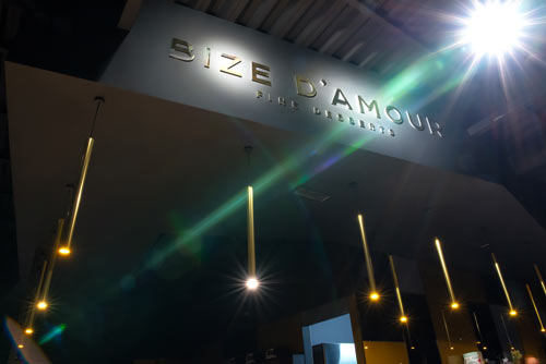
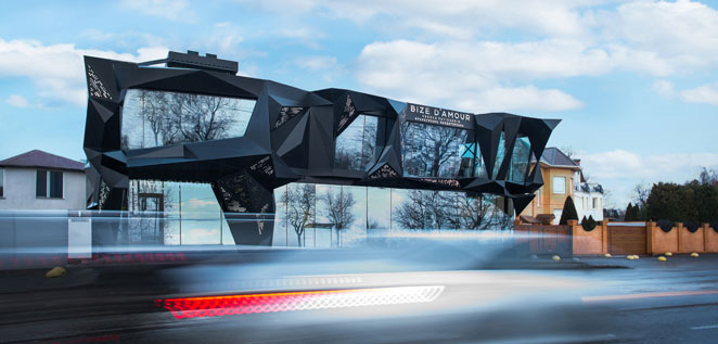
On the eve of the New Year, amid an elegant and stylish Christmas tree, it’s the opportune time and place to reflect on the past 12 months. The opening of the new French confectionery “Bize D’Amour” in the upscale district known as “Fountain” by the sea in Odesa could have been an ordinary event. Instead, it turned into a sensation, both gastronomic and architectural. The new building, with its distinctive sharp black forms, was a source of surprise and admiration. Enormous panoramic windows, reflecting the gliding yacht on the waves and the snow-white clouds drifting by, starkly contrasted with the surrounding houses.
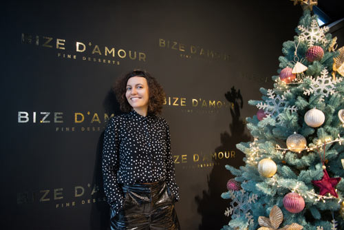
Foreign specialists led groups of tourists to “Bize D’Amour,” sharing enthusiastic reviews about the building and the confectionery. Meanwhile, local residents either voiced support or raised an eyebrow in bewilderment. The ensuing heated discussions only added fuel to the fire, fueling interest in the new landmark. We decided to delve into a conversation about Odesa’s new architectural icon with the project’s architect, Zhanna Kiseleva.
— You have successfully executed various restaurant and cafe projects in Odesa, but this is your first collaboration with restaurateur Roman Vynogradov, correct? How did your creative partnership come about, and who initially proposed the design for the exterior and interior in such a distinctive shape?
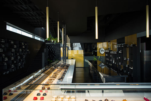
Yes, this is our inaugural joint project, and it has become truly iconic! In the initial stages, we presented several sketches. This black and white version was the boldest. We didn’t even anticipate the client would opt for it. However, Roman selected precisely this sketch for the future confectionery, and we are profoundly grateful to him! The concept for a graphic solution for a confectionery had been brewing in my mind for a long time, dating back to a trip to South America. I witnessed large pieces of natural chocolate there. When working on the “Bize D’Amour” project, that visual image clicked. A massive, chunked piece of chocolate! The building’s facade wasn’t designed haphazardly but purposefully, with everything meticulously calculated. A strong design will always be provocative, evoking a sense of the history of the moment. In some respects, this design even mirrors the current semi-military situation in Ukraine—sharp, chopped, triangular shapes complemented by smoother, more feminine ones. A harmony of male and female nature.
— Why did you choose black and white for such a shape, a piece of chocolate?
In this project, the black color plays the role of a prima ballerina. I have an appreciation for Malevich and his “Black Square.” I have a general affinity for black—it provides protection, creates comfort and coziness, accumulates and preserves energy, and helps focus on what matters most. In “Bize D’Amour,” black serves as a powerful focal point, harmoniously complemented by elements of white. There is nothing superfluous; the emphasis is on substance and form. Like a “white kiss,” it may not be extensive, but it holds significant importance.
— What architectural style was chosen for the new project of the French pastry shop “Bize D’Amour”? Why was such a choice made?